


The Galaxy S26's Design Refresh Feels Like Too Little, Too Late
The Galaxy S26 is shaping up to be Samsung's most significant design departure in years—and while I called it months ago, I can't shake the feeling that this refresh might not be the game-changer the lineup desperately needs.
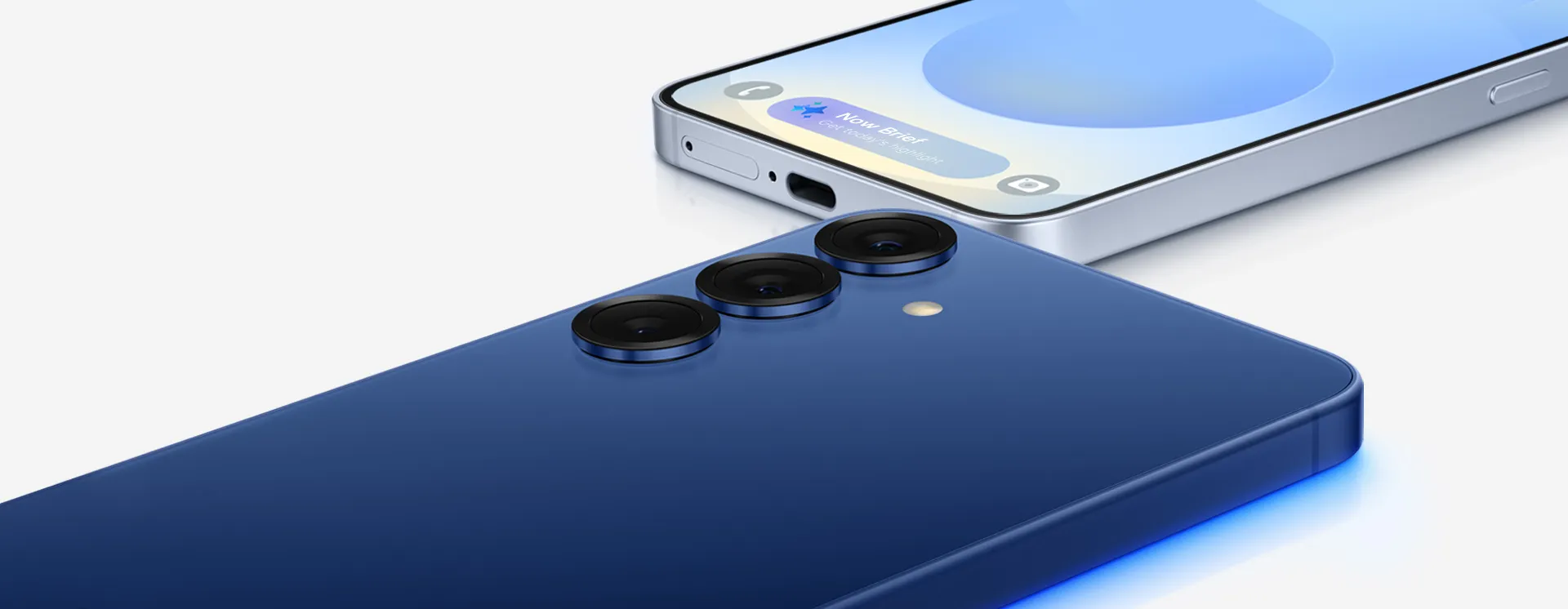
Samsung's flagship design language has grown stale. Where competitors experiment with materials, form factors, and visual identity, the Galaxy S series has coasted on incremental tweaks to a formula that peaked with the S21 in 2021. The rumored S26 changes—reportedly including flatter edges, refined camera integration, and thinner bezels according to industry leakers—represent progress, sure, but in a market where Apple's titanium iPhone 15 Pro, Google's distinctive Pixel camera bar, and OnePlus 12's marble glass treatments are pushing boundaries, "better than before" might not cut it anymore.
Here's what concerns me: Samsung seems to be chasing trends rather than setting them. The expected design direction borrows heavily from what's already working elsewhere—flatter edges here, camera module adjustments there—without the bold statement that once defined Galaxy flagships. It's the design equivalent of playing it safe when the scoreboard shows you're already behind.
Why this design shift was inevitable (but predictable)
The writing was on the wall for anyone paying attention to Samsung's broader product strategy. The Galaxy A series has been steadily encroaching on flagship territory with premium-feeling designs at mid-range prices, creating an awkward visual overlap that undermines the S series' luxury positioning. When your $449.99 Galaxy A54 (U.S. launch price) looks nearly as refined as your $1,200 Galaxy S25 Ultra from across a room, you've got a branding problem that no amount of spec sheet superiority can overcome.
Samsung's design team faced a choice: either elevate the S series dramatically or risk continued commoditization. The rumored S26 changes suggest they've chosen the former, but the execution feels more reactive than revolutionary. We're seeing design cues that address criticisms—those thinner bezels, more cohesive camera integration, refined materials—without introducing a genuinely fresh aesthetic direction that screams "flagship" at first glance.
The timing matters too. Samsung's market share in premium segments has faced mounting pressure from Chinese manufacturers like Xiaomi (with the 14 Ultra at $1,199) and OPPO (Find X7 at $799) offering flagship specifications and striking designs at competitive prices. The S26 redesign isn't happening in a vacuum; it's a direct response to competitive threats that have been building since the S24 and S25 cycles. The question is whether this response arrived soon enough and goes far enough.
Having reviewed every Galaxy S flagship since the S10, I've watched this evolution unfold. Each generation brought changes, yet somehow the cumulative effect felt less impactful than individual iPhone refinements or Google's bold Pixel pivots. That's the paradox Samsung needs to break.
What the competition is doing differently
Apple's design philosophy remains infuriatingly effective: establish a visual language, refine it relentlessly, and make incremental changes feel significant through material quality and finishing. The iPhone 15 Pro's titanium frame and Action Button represent refinement of the flat-edge design language established with the iPhone 12 in 2020. The consistency is actually a strength because it's backed by fit-and-finish that justifies premium pricing, plus secondary benefits like a robust accessory ecosystem and higher resale values. Samsung's approach has been the opposite—frequent changes that somehow feel less impactful.
Google took risks with the Pixel's camera bar, creating instant visual recognition even if the design polarizes users. You might love it or hate it, but you certainly recognize a Pixel when you see one. That's powerful branding. OnePlus has leaned into premium materials and distinctive color treatments that make their flagships feel special in hand. Even Xiaomi's flagship designs show more willingness to experiment with form and proportion.
Samsung's rumored S26 direction, by contrast, feels like design-by-committee—addressing complaints without taking genuine creative risks. It's the corporate approach to design evolution: identify what's working for competitors, smooth out the rough edges, and implement a version that won't offend anyone. The problem? In the premium segment, playing it safe rarely creates the kind of desire that drives sales.
PRO TIP: When evaluating flagship design changes, look beyond initial aesthetics to material quality, ergonomics, and whether the design enables or constrains future innovation. The best flagship designs commit to a distinctive visual identity and execute it flawlessly across every detail.
The most successful flagship designs in recent years share that common trait: total commitment. Samsung's challenge isn't just updating the S series design; it's establishing a clear design language that differentiates it from both budget competitors and rival flagships. The S26 changes, as currently rumored, seem to split the difference rather than stake out new territory.
The deeper problem Samsung needs to solve
Design refreshes only matter if they're supported by meaningful functional improvements and a clear value proposition. Samsung's recent flagships have struggled not just with aesthetics but with justifying their premium positioning when competitors offer comparable performance, better software experiences, or more innovative features at lower prices.
Here's the bottom line: a prettier phone that still ships with duplicate apps, confusing settings menus, and bloatware isn't actually addressing the core issues that push users toward competitors. In my testing of the S25 Ultra, Samsung's Settings menus bury essential features like battery optimization three levels deep, while Pixel surfaces them immediately. The company also needs to address the feature bloat and software complexity that plague One UI. A cleaner design language should extend beyond hardware into the user interface, creating a cohesive experience that feels premium from unboxing through daily use.
The integration matters more than individual elements. Apple's success comes from hardware and software working in harmony to create a unified experience. Google's Pixel line, despite hardware quirks, attracts users through software excellence. Samsung has the technical capability to match both—the company's vertical integration and manufacturing scale provide advantages competitors lack—but the execution often feels fragmented, like different teams working without a shared vision.
The S26 design changes matter most if they signal a broader commitment to refinement and focus across the entire product experience. Without that holistic approach, even the most beautiful hardware redesign becomes just another missed opportunity in a series of them.
Where Samsung goes from here matters more than the S26 itself
The real test isn't whether the S26 design improves on the S25—it's whether Samsung can establish a sustainable design direction that carries through multiple product cycles. You don't need to be a tech enthusiast to spot an iPhone's silhouette. That recognition comes from Apple's commitment to design consistency that builds brand recognition over years, not months. Samsung's frequent pivots have created visual confusion across their lineup.
If the S26 represents the beginning of a committed design language that Samsung refines and elevates through at least three product cycles (through 2027), these changes could prove significant in retrospect. If it's another one-off refresh before the next redesign, Samsung will continue struggling to establish the visual identity their flagship line needs.
The competitive landscape won't wait for Samsung to figure this out. Chinese manufacturers are moving upmarket with aggressive pricing and increasingly refined designs. Apple continues dominating the premium segment with consistent execution. Google is building Pixel into a credible flagship alternative with each generation. Samsung's window for a meaningful design statement is closing, and the S26 changes—while welcome—feel like they might be too cautious to truly move the needle.
The key takeaway is that what Samsung needs isn't just a design refresh—it's a design philosophy that can anchor the brand through multiple product generations while still allowing for evolution and refinement. That requires creative courage to commit to a distinctive vision rather than chasing what seems safe based on competitor success.
Ask yourself: would you recognize a Galaxy S phone in someone else's hand from across a room? If the answer is anything but an immediate yes, Samsung hasn't solved their fundamental problem. The S26 will tell us a lot about whether the company is ready to address that question seriously—or if they're content with another cycle of "better but not different enough."


Comments
Be the first, drop a comment!