


Reviewed by Corey Noles
Samsung's Theme Park module has quietly evolved into something Apple's Liquid Glass wishes it could be—customizable, practical, and actually responsive to what users need. While Cupertino fumbles around with translucent effects that demand entire OS updates, Samsung just dropped a simple app refresh that lets you dial in exactly the glass aesthetic your eyes, wallpaper, and usage patterns actually require.
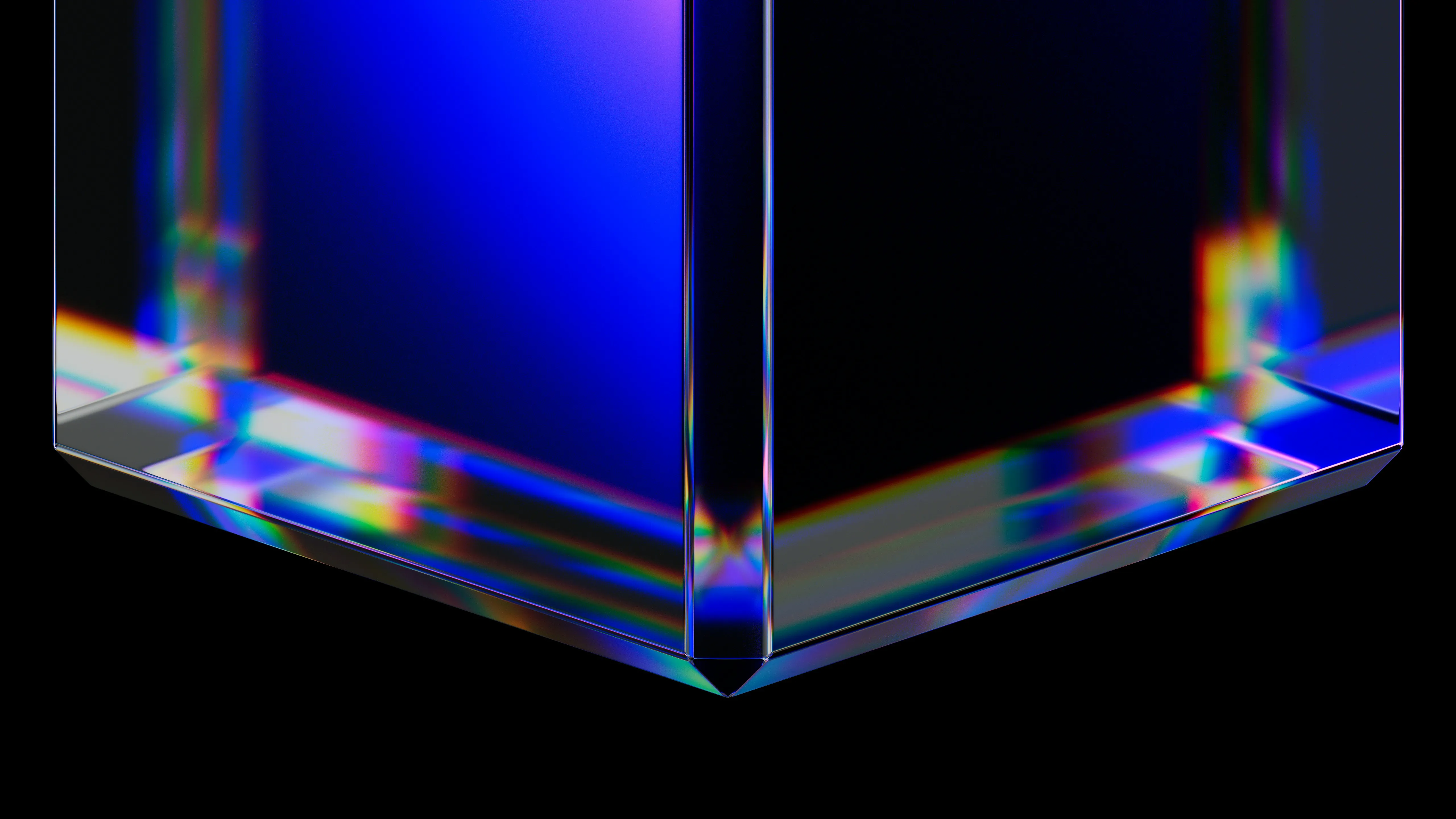
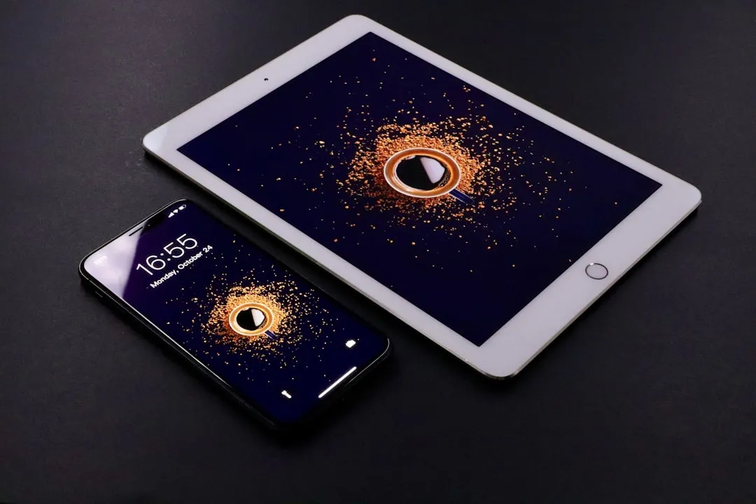
Samsung launched Theme Park version 1.1.01.23 with a new "Effects" menu offering five distinct options for icon customization: Basic, Film Grain, Duotone, Glass, and Gradient. The Glass effect specifically targets what Apple's trying to achieve with its Liquid Glass rollout in iOS 26—but here's the kicker: Samsung's version lets you adjust opacity and transparency levels to your exact preference, something Apple's preset approach can't match.
Think about the scenarios where this matters: bright sunlight making translucent elements invisible, busy wallpapers killing text readability, or visual accessibility needs requiring higher contrast. Samsung's approach acknowledges these real-world variables from the start.
Why Samsung's approach actually makes sense
Here's the architectural advantage that changes everything: Samsung can implement UI changes through minor app updates thanks to One UI's modular design, while Apple's integrated approach requires major OS overhauls for similar functionality. This isn't just about convenience—it represents fundamentally different philosophies about user interface evolution.
One UI's layered architecture means Samsung can push glass effect updates through the Theme Park app without touching core system files. When users want tweaks, they get them immediately. When problems arise, fixes deploy fast. Apple's iOS 26 has made multiple beta adjustments to Liquid Glass transparency levels after user feedback, tweaking navigation bars in Photos, Music, and the App Store across four different betas.
The performance implications matter too. Theme Park's latest update provides stability improvements specifically for One UI 7 devices, optimizing how glass effects interact with the system renderer. Samsung can fine-tune resource usage through targeted updates, while Apple's system-level implementation requires balancing performance across all UI elements simultaneously—a complexity that often leads to the resource-intensive glassmorphism implementations that drain batteries and stutter on animations.
Apple's Liquid Glass stumbles where Samsung succeeds
Liquid Glass represents Apple's first major UI overhaul in 10 years, rolling out across iOS, macOS, iPadOS, and Vision Pro with impressive technical execution—lensing effects and contextual awareness that dynamically bend light and respond to content. But technical sophistication doesn't solve the fundamental accessibility problem that has plagued glassmorphism since its 2020 emergence.
Apple's implementation faces significant accessibility concerns around text readability and contrast ratios, especially when translucent elements interact with complex backgrounds. The Web Content Accessibility Guidelines require a minimum contrast ratio of 4.5:1 for normal text, but translucent glass over varied backgrounds creates constantly shifting contrast that may fail this standard without warning.
Samsung sidesteps this by putting control in users' hands. Don't like how your sunset wallpaper makes menu text disappear through the glass effect? Reduce opacity until text becomes readable. Find that outdoor lighting makes translucent elements vanish? Increase contrast on the fly. It's the difference between adaptive technology and accommodating technology.
The customization philosophy reveals deeper differences. Apple's Liquid Glass uses preset Regular and Clear variants that Apple's designers tuned for what they consider optimal experiences. Samsung's Effects menu provides granular controls for glass intensity, letting users optimize for their specific visual needs, wallpaper choices, and lighting conditions.
Making it work: Samsung's practical UI philosophy
Samsung's Theme Park approach reflects something more sophisticated than simple feature addition—it demonstrates inclusive design thinking built into the system architecture. The Effects menu integrates with Samsung's broader Good Lock ecosystem, working alongside QuickStar for system bar customization and Keys Cafe for keyboard theming, creating a unified toolkit for accessibility and personalization.
This modular philosophy addresses user agency as a core UX principle. Rather than declaring one perfect glass aesthetic, Samsung acknowledges that effective glassmorphism depends entirely on context—the user's visual capabilities, their wallpaper complexity, their usage environment, even their personal preferences for visual noise versus clarity.
The technical execution supports this philosophy seamlessly. Theme Park now creates and applies themes instantly without requiring APK installations, and newly installed apps automatically adopt your chosen glass styling. Users establish their preferred opacity levels once, then the system maintains that choice across app installations and updates.
PRO TIP: Start with Samsung's Glass effect at medium opacity, then adjust based on your wallpaper's visual complexity. High-detail backgrounds need more blur and less transparency for text legibility, while solid colors can handle higher transparency levels that show off the glass aesthetic.
The bigger picture on glass UI execution
This Theme Park update illuminates a crucial evolution in how design trends should mature. Glassmorphism emerged as a major design trend around 2020, but early implementations prioritized visual appeal over practical usability, creating accessibility issues and performance problems that made the trend feel like style over substance.
Samsung's implementation suggests the trend's real potential was always in user-centered adaptability. Instead of forcing universal acceptance of designer-determined glass aesthetics, Theme Park demonstrates that glass UI works best when used sparingly and purposefully—which inherently means different implementations for different users, contexts, and needs.
The contrast with Apple's approach reveals two competing visions for design system evolution. Apple may continue tweaking Liquid Glass based on user feedback, but they're fundamentally seeking the "correct" universal implementation through iterative refinement. Samsung's betting that maturity in design trends comes from empowering users to create contextually appropriate implementations.
This philosophical difference extends beyond mobile interfaces into broader questions about technology's role in human experience. Samsung's customizable glass UI represents technology adapting to human diversity—acknowledging that visual processing, environmental conditions, and personal preferences create legitimate variation in what "good design" means for different people.
The Theme Park update isn't just about prettier phone interfaces—it's a demonstration of how to implement design trends with human agency built in from the ground up, treating customization as accessibility and user control as a feature, not a complication.


Comments
Be the first, drop a comment!