There's a never-ending selection of app launchers that want a permanent spot on your Android device. While some keep the stock-Android look with beefed-up versions of Google's launcher, Blur is relatively new on the scene, with a unique approach to app management that sets it apart.
Made by Klinker Apps, the same group that brought us EvolveSMS, which was covered in my desktop-to-SMS guide, and the popular Talon for Twitter, Blur gives your apps their own Google Now-style info page.
What this means is, you can swipe left to see a page for weather and your daily agenda, and swipe again to go straight into your text messages. Being able to have separate pages for texts and Twitter in full view is certainly more convenient than launching each app individually.
Download & Install Blur
Begin by installing Blur - A Launcher Replacement from the Google Play Store (it's free).
Install EvolveSMS for a Text Messaging Info Page
In order for Blur to show you all of your text message conversations in a home screen page, you'll need to also install EvolveSMS. For more info on using EvolveSMS as your text messaging client, see my other guide.
Install Blur - Unread for Notification Counts (Optional)
Before you dive into the Blur launcher, you'll also want to install Blur - Unread (Experimental). This add-on will allow Blur to show unread counts for apps. You can skip this step if you want, but I find this to be incredibly useful for glancing to see which apps have pending notifications.
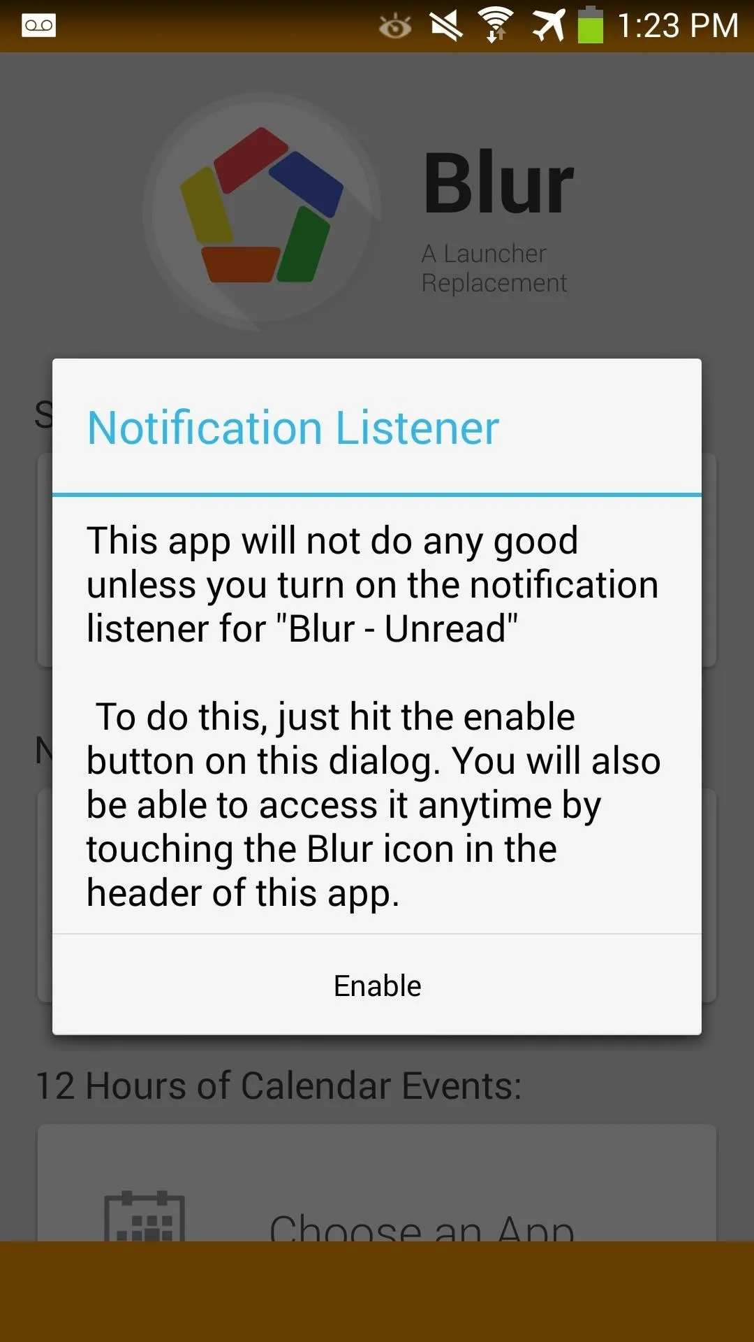
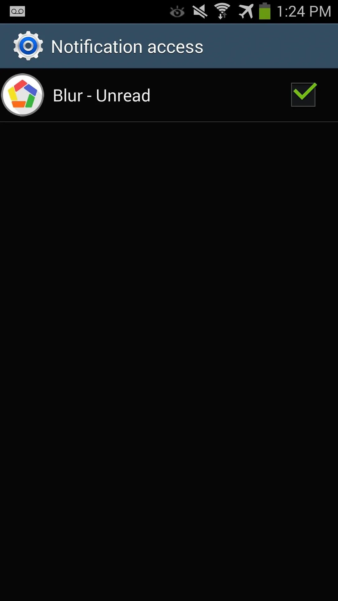
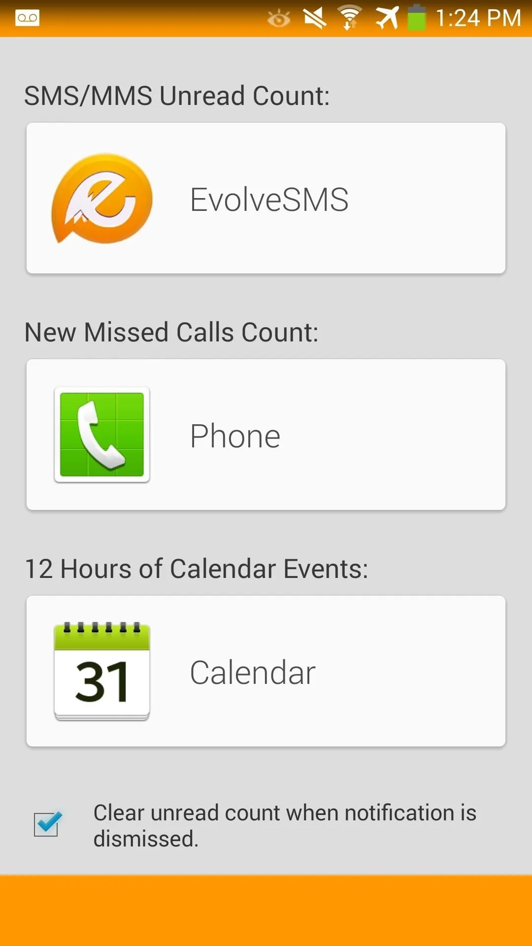
After it is installed, launch Blur - Unread. It'll prompt you to enable notification listening, so check its corresponding box. Once that's enabled, add EvolveSMS, Phone, and Calendar for showing unread counts.


Install Talon for Twitter (Optional)
You're almost done getting everything we need for Blur. If you regularly use Twitter, install Talon for Twitter. It does cost $1.99, but I highly recommend it if you want a Twitter feed to be integrated into a home screen app page.
In addition to Talon, you'll also need to Talon (Blur Launcher Page) for Twitter integration.
Customize Blur & Its App Pages
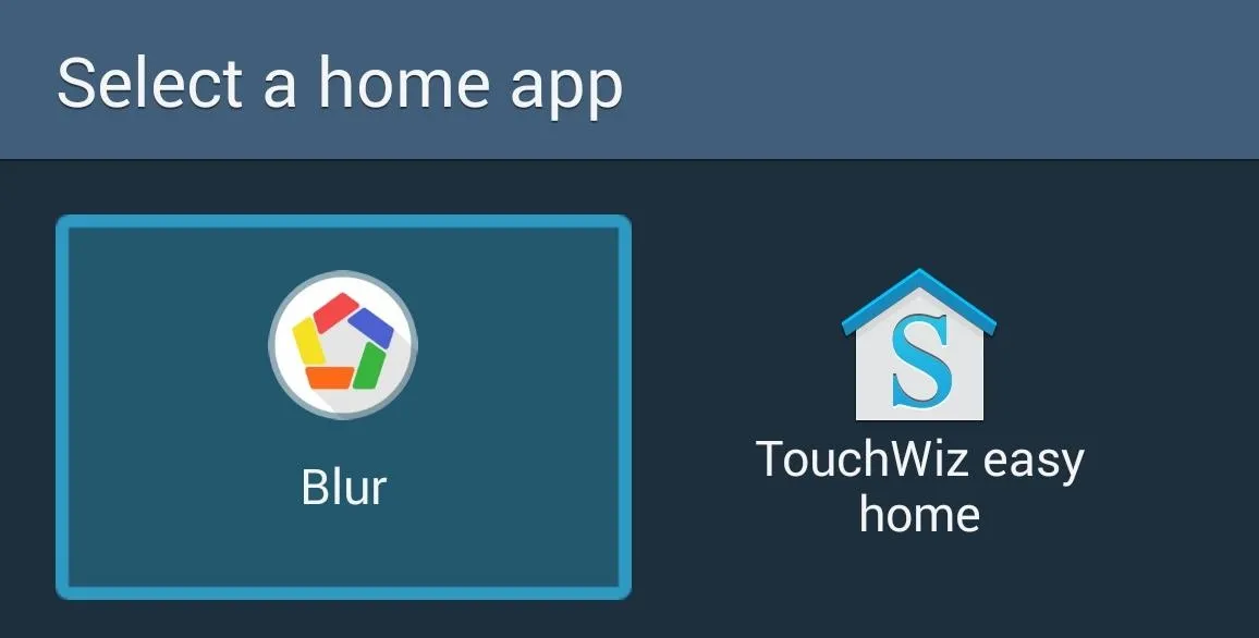
Now that you have everything you need, launch Blur, and if it prompts you to, set it as the default launcher.
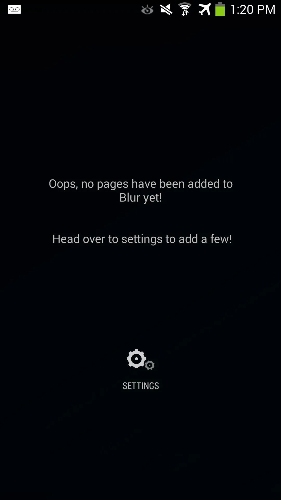
Blur will show its quick start guide on the first launch, but you can quickly dismiss it.
Now, swipe right to bring up the Blur app page to begin customizing the launcher. Tap the Settings icon to begin, and under Page Settings, select Page Picker to add app pages.
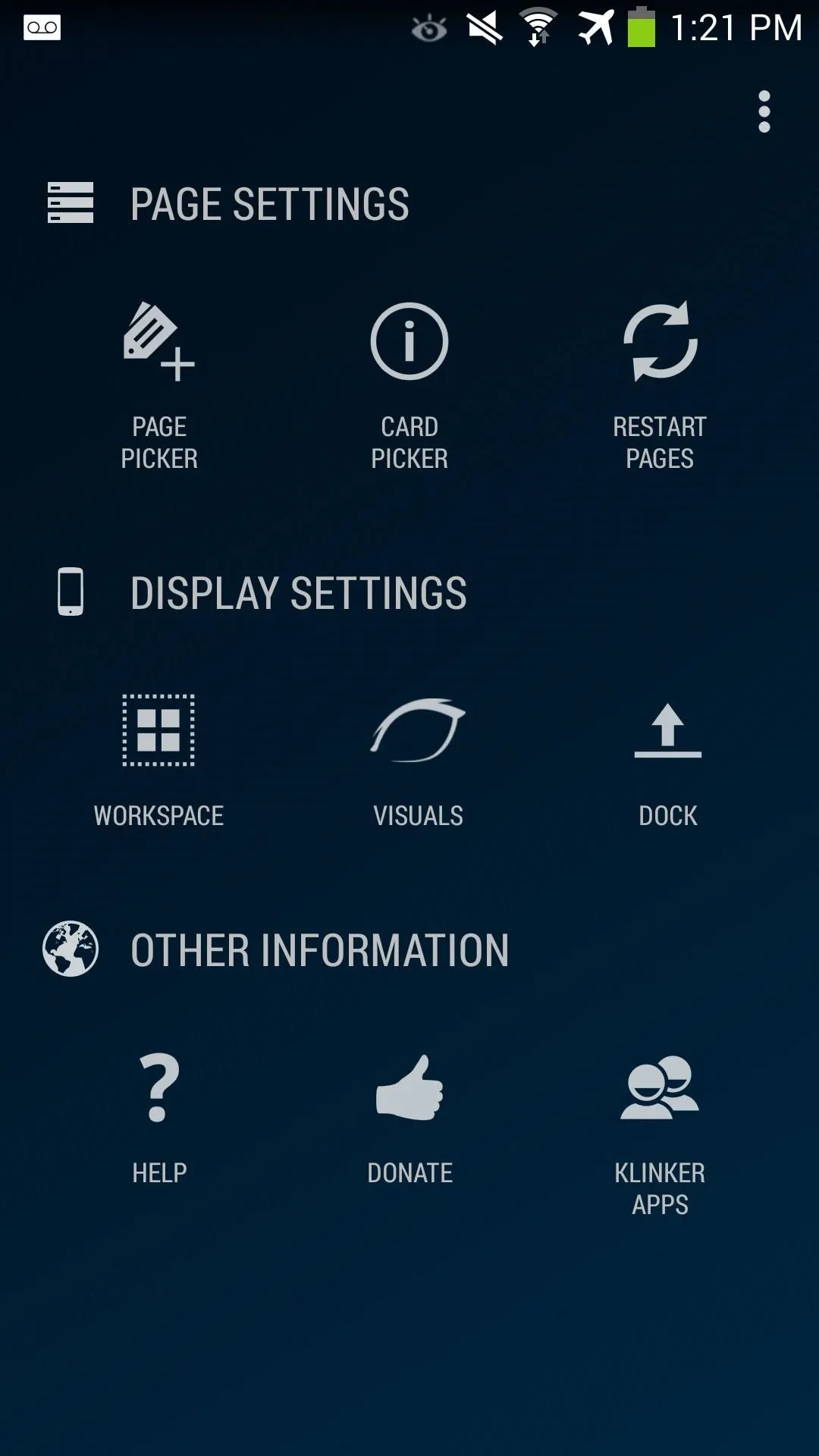


In Page Picker, tap the add icon to add Blur Info. I recommend adding EvolveSMS for Page 2 and Talon for Twitter for Page 3. When complete, tap the checkmark icon to finish adding your pages.
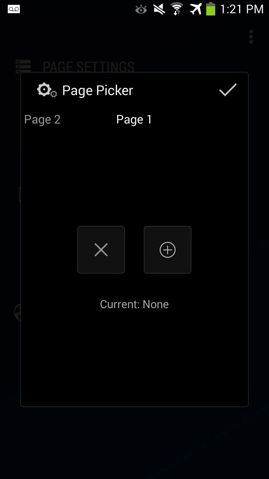
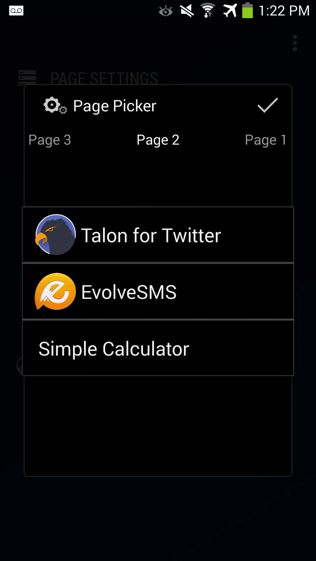


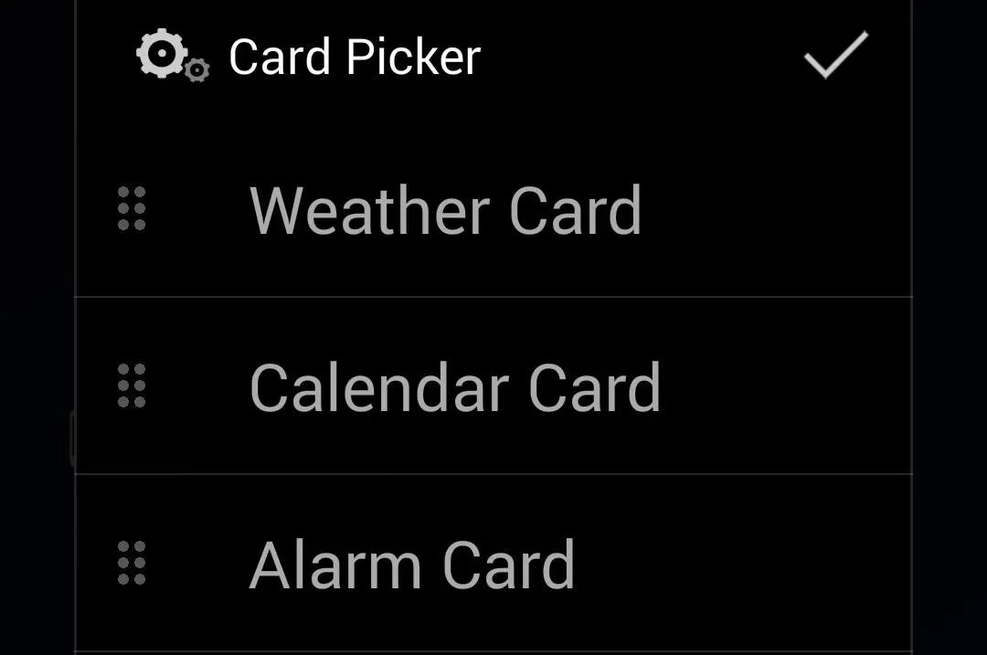
Then, navigate back to Page Settings and tap Card Picker. Tap Create Card and add all three cards: Weather, Calendar, and Alarm. Again, tap the checkmark box to finish configuring.
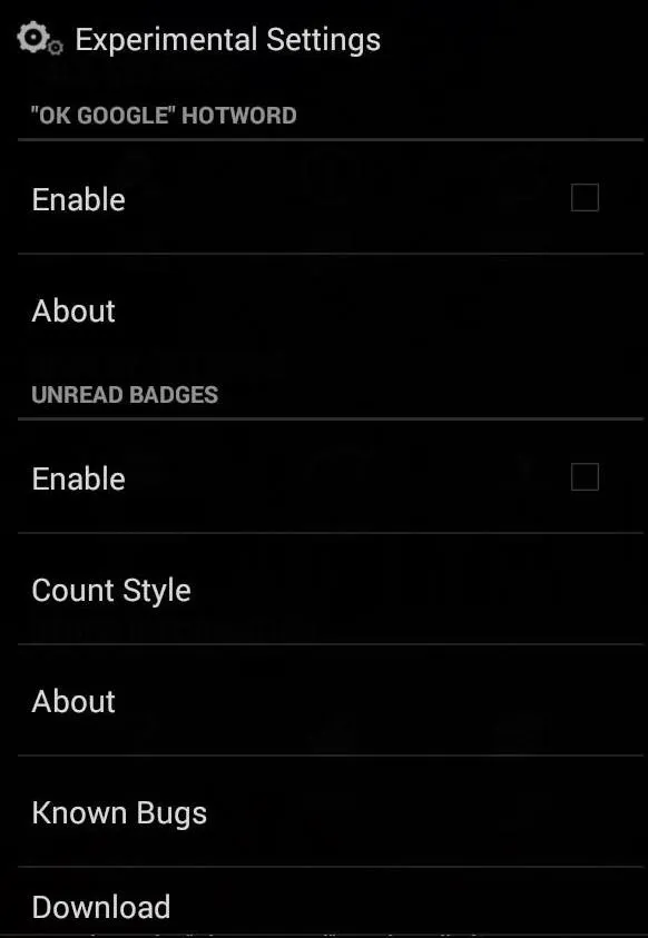
In the main settings page, hit the 3-dot menu button and select Experimental Settings. From here, you can enable "OK Google" hotword detection and Unread Badges (as long as the app from Step 3 is installed).
Under Display Settings in the main menu, you can customize your app grid sizes, apply app icons, change icon sizes, and also the dock.
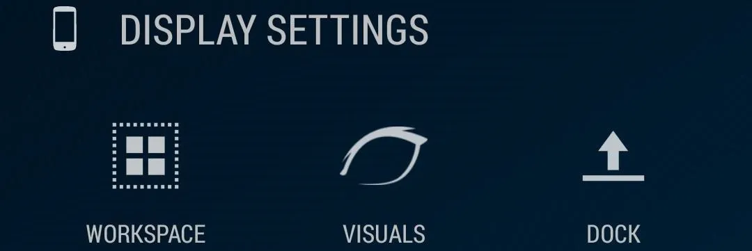


Here's a quick overview of each option:
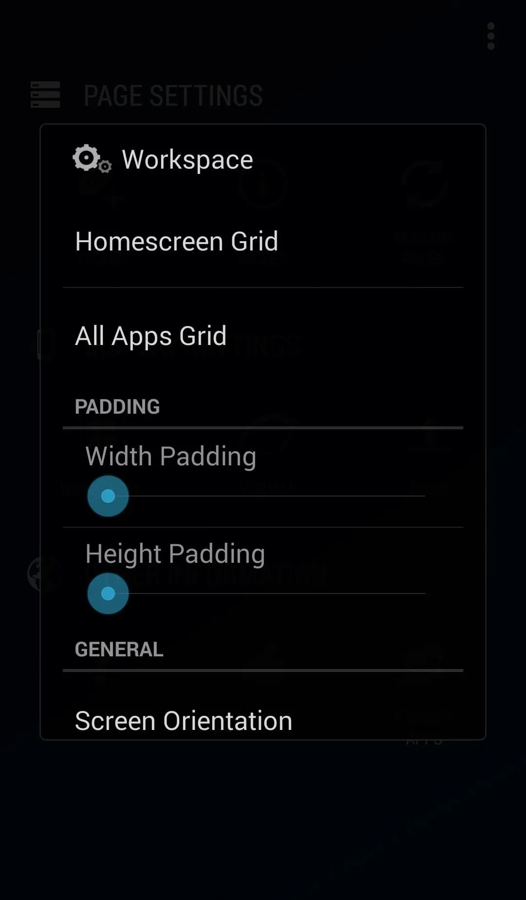
Workspace
Tap Workspace to change both your home screen and app launcher grid size. You can also add padding to the grids if you want more space in-between app icons. If you rather have your apps shown in landscape instead of portrait, you can configure it here as well.
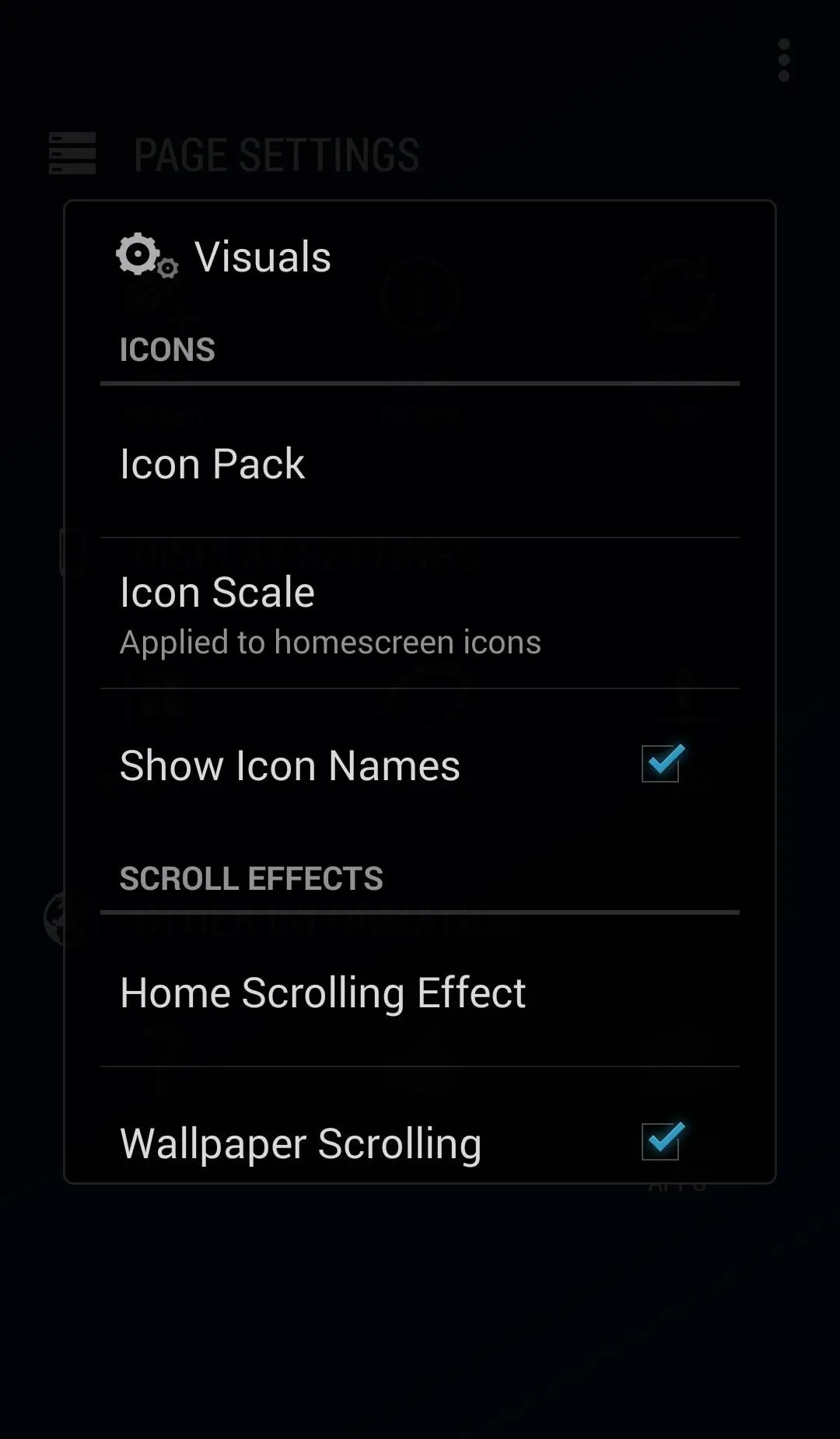
Visuals
In Visuals, you can set your desired icon pack if you have one downloaded. You can also change icon sizing and scaling here. Anything from scrolling effects, app style, and font type are also configurable.
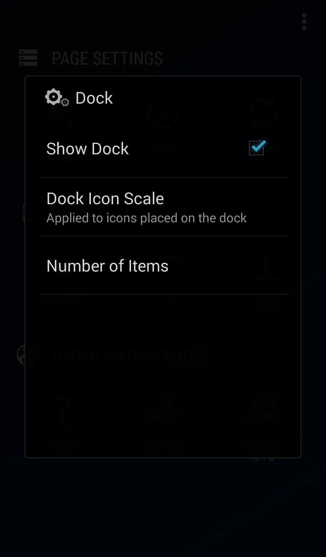
Dock
In Dock, there are settings for showing or hiding the app dock, icon size and scaling, and also configuring the amount of items shown.
Blur Up & Running!
Now that we have it all set up, it's time to enjoy it. Here are a few screenshots of Blur up and running and fully configured on my Samsung Galaxy Note 3. Below is the Weather, Calendar, and Alarm page.
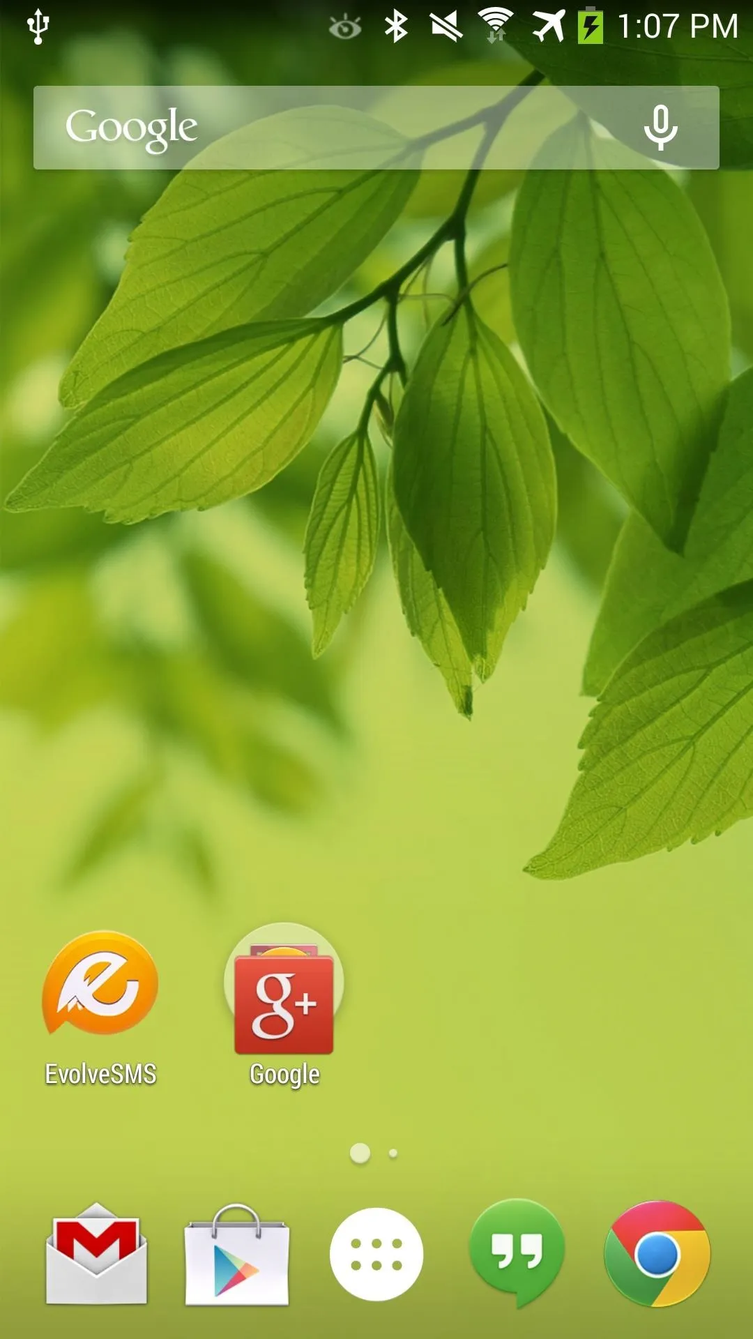
Main screen.
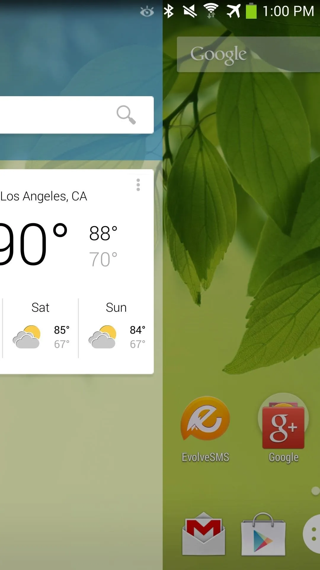
Swiping over...
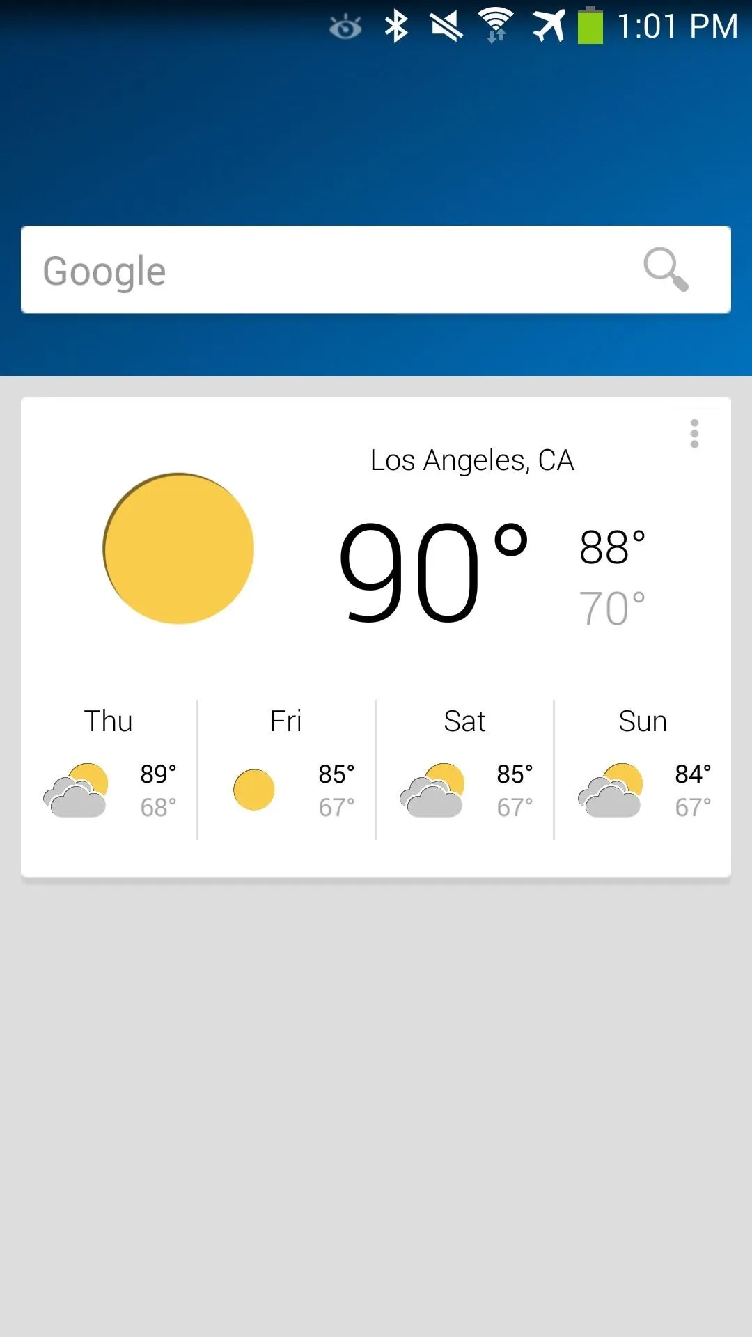
...Blur Info page.

Main screen.

Swiping over...

...Blur Info page.
And I have the second page assigned to EvolveSMS for my messaging.
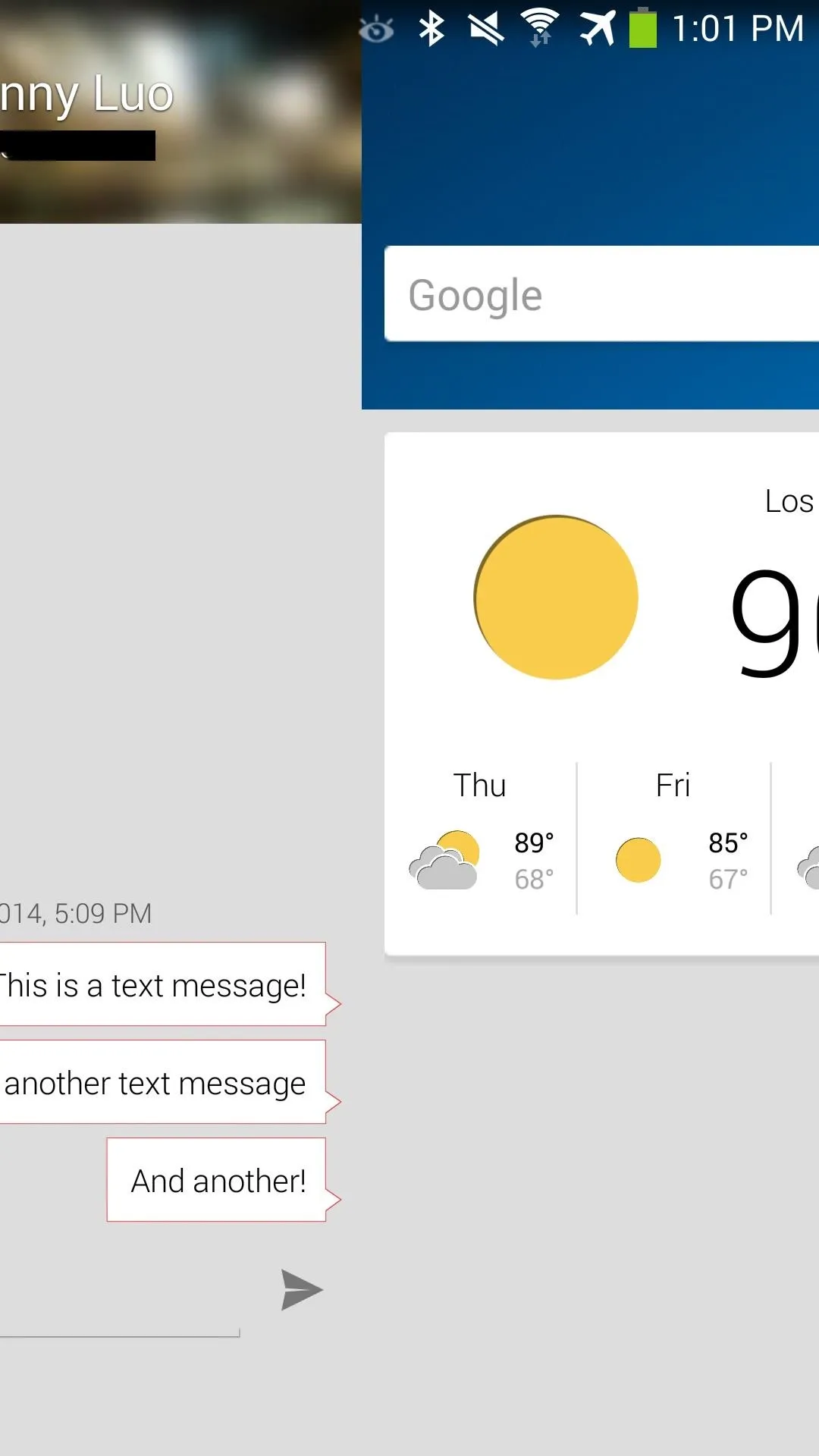
Swipe over.
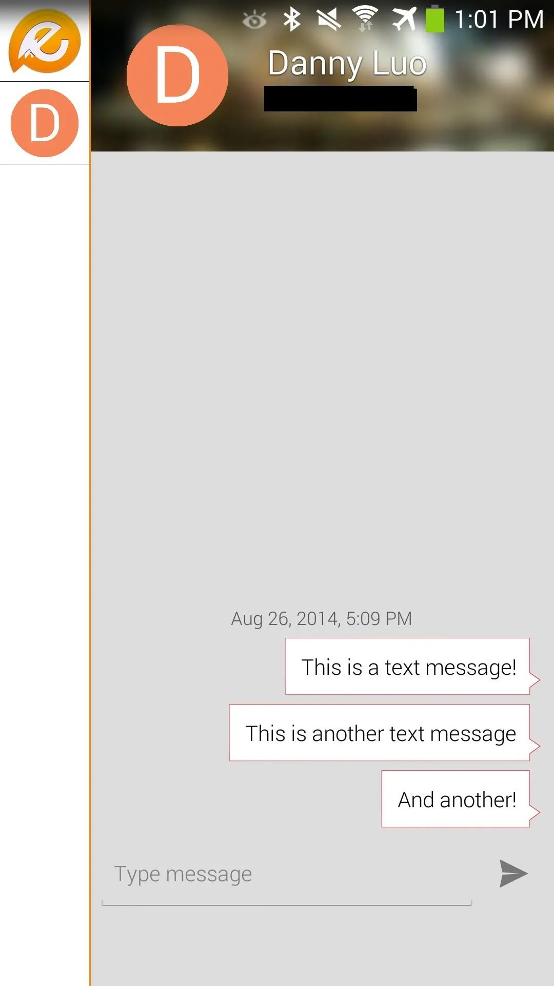
Messaging page.

Swipe over.

Messaging page.
Blur's still new to the game, but as developers add support for Blur, expect to see more dedicated app pages that will make for quick access. Right now, I really like being able to just swipe and easily see all my messages. Definitely keep an eye out for Blur if you like these nifty app pages.
Tell us in the comments below how you're liking Blur and if you have any questions setting it all up.









Comments
Be the first, drop a comment!