In a world where more features are king, sometimes it's a good thing to breathe, take a step backwards and keep it simple. With home launchers, this isn't often the case, as developers add a galore of features to their apps in order to be at the top of the game.
Unfortunately, sometimes these launchers become too dense for their own good, making it difficult to access it in an efficient and orderly manner. Ever heard the expression less is more?
With today's softModder tutorial, we're going to go through SickSky Launcher, the most lightweight and minimal launcher you'll ever have for your Samsung Galaxy Note 3 or other Android device.
As simple as they come, SickSky (available on Google Play) is an extremely clean and minimalistic Android launcher (still currently in beta) from Michael Bentz. Designed to be elementary—in the finest sense—the launcher relegates to only a handful of screens.
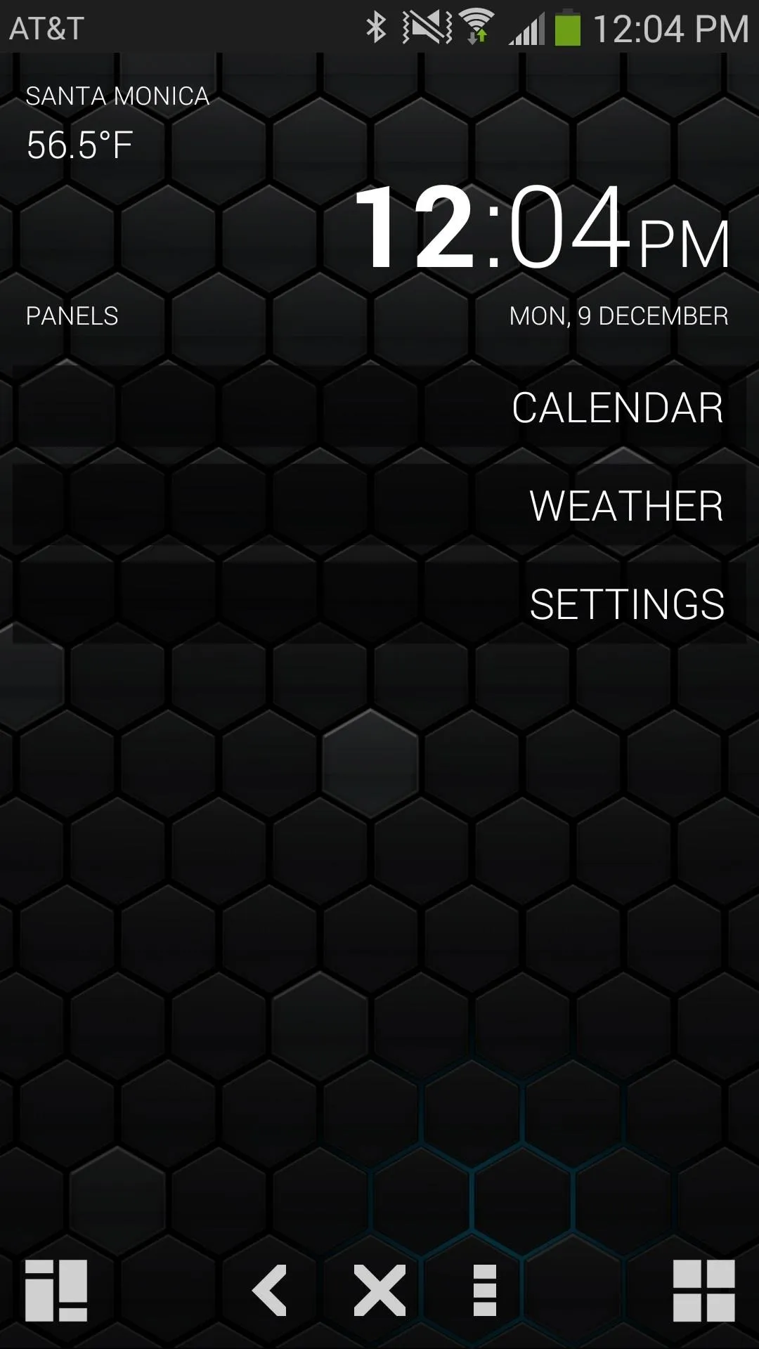
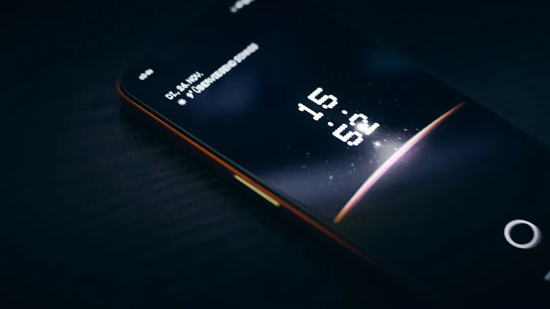
At the home screen, you'll find a blank page with a large transparent top bar full of basic information (location, weather, time, date), while the bottom bar is much smaller and consists of two icons. The icon on the left takes you to the calendar while the icon on the right is for applications. If you want to access Google Now, simple double-tap anywhere on the blank screen.
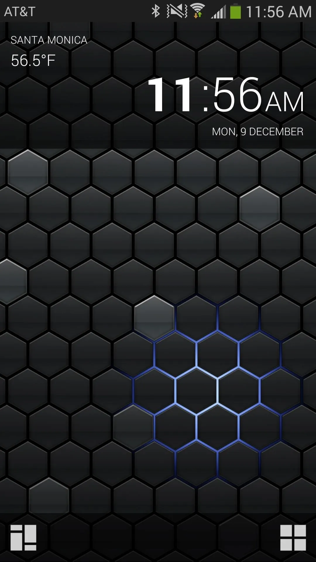
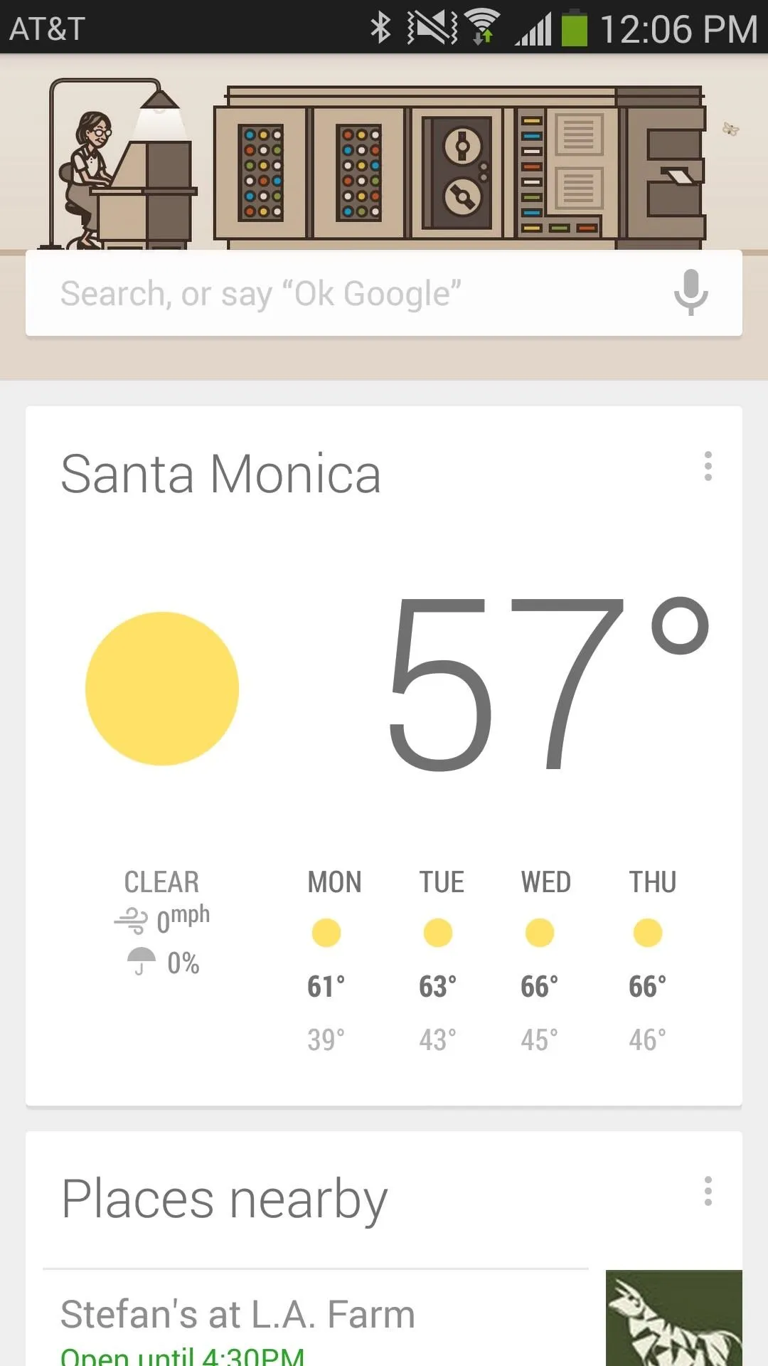


In addition to using the two icons in the bottom black bar, you can also use swipe gestures in order to access the other pages of the launcher.
- If you swipe up (from the home screen), you can access all of the applications on your smartphone.
- Swiping to left will take you to a list of saved events in your calendar. To add an event, tap the three-dot menu icon at the bottom of the launcher.
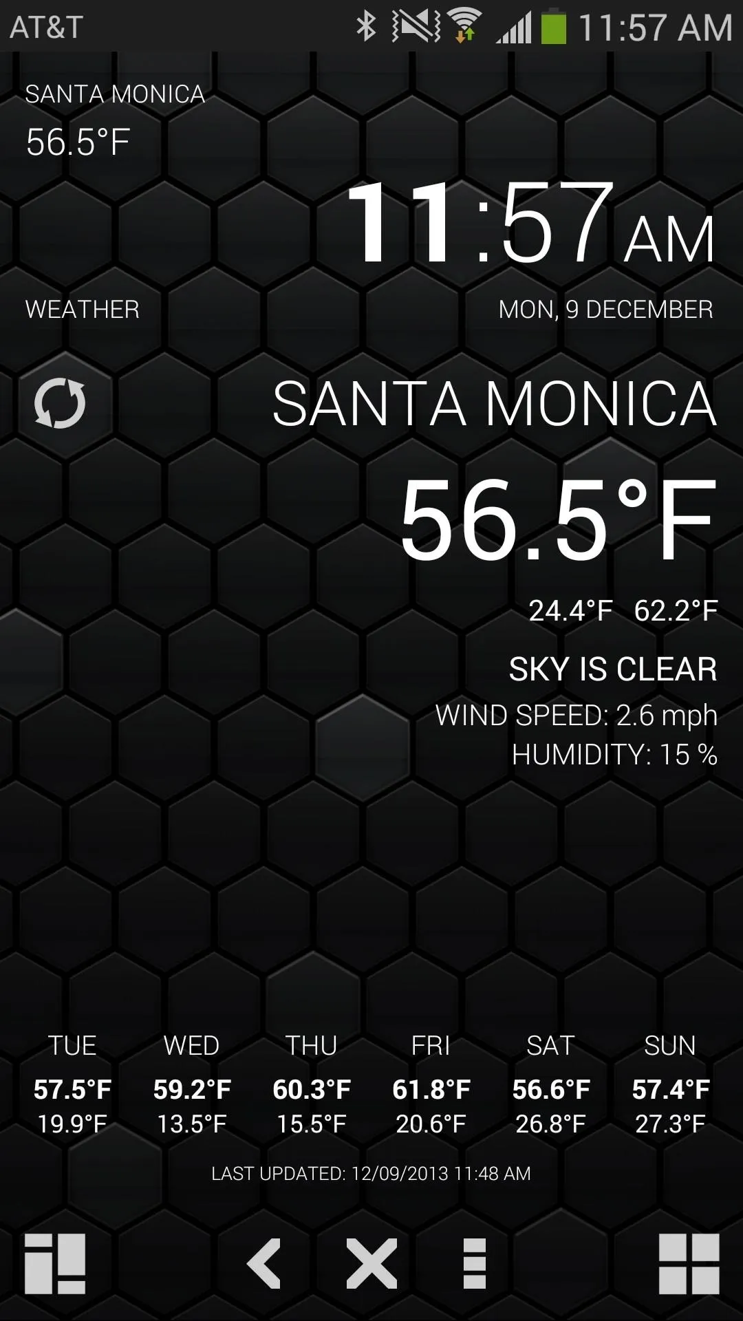
- To launch the weather page, swipe to the right, which is made up of today's forecast and other statistics as well as the predicted weather for the upcoming week.
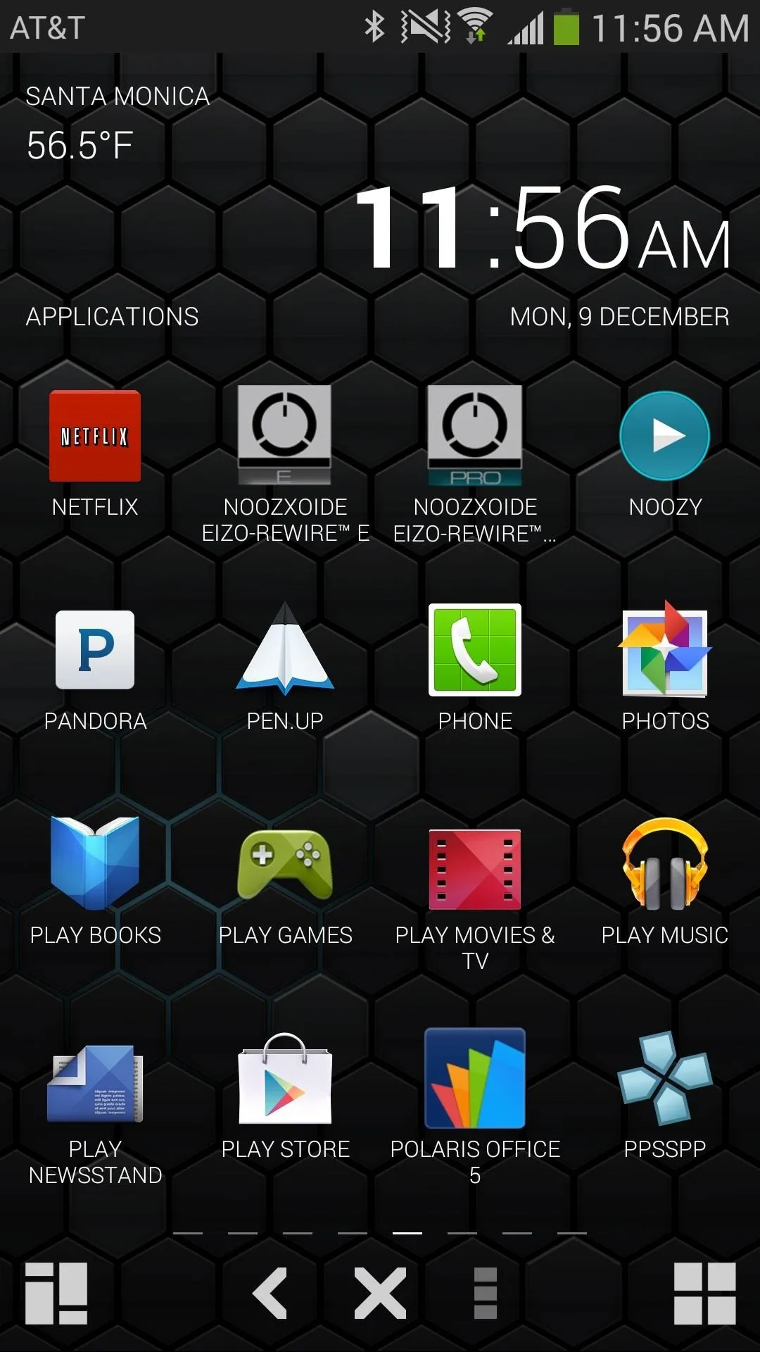
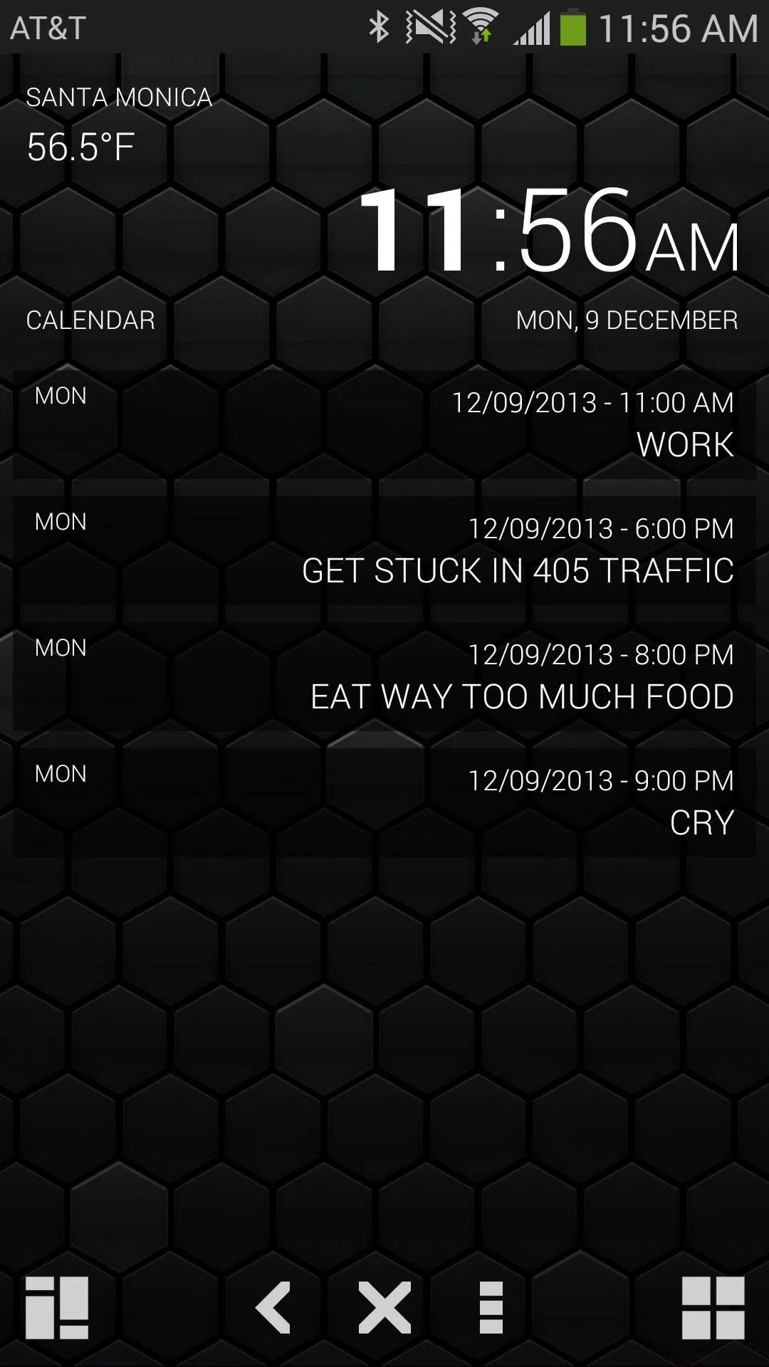


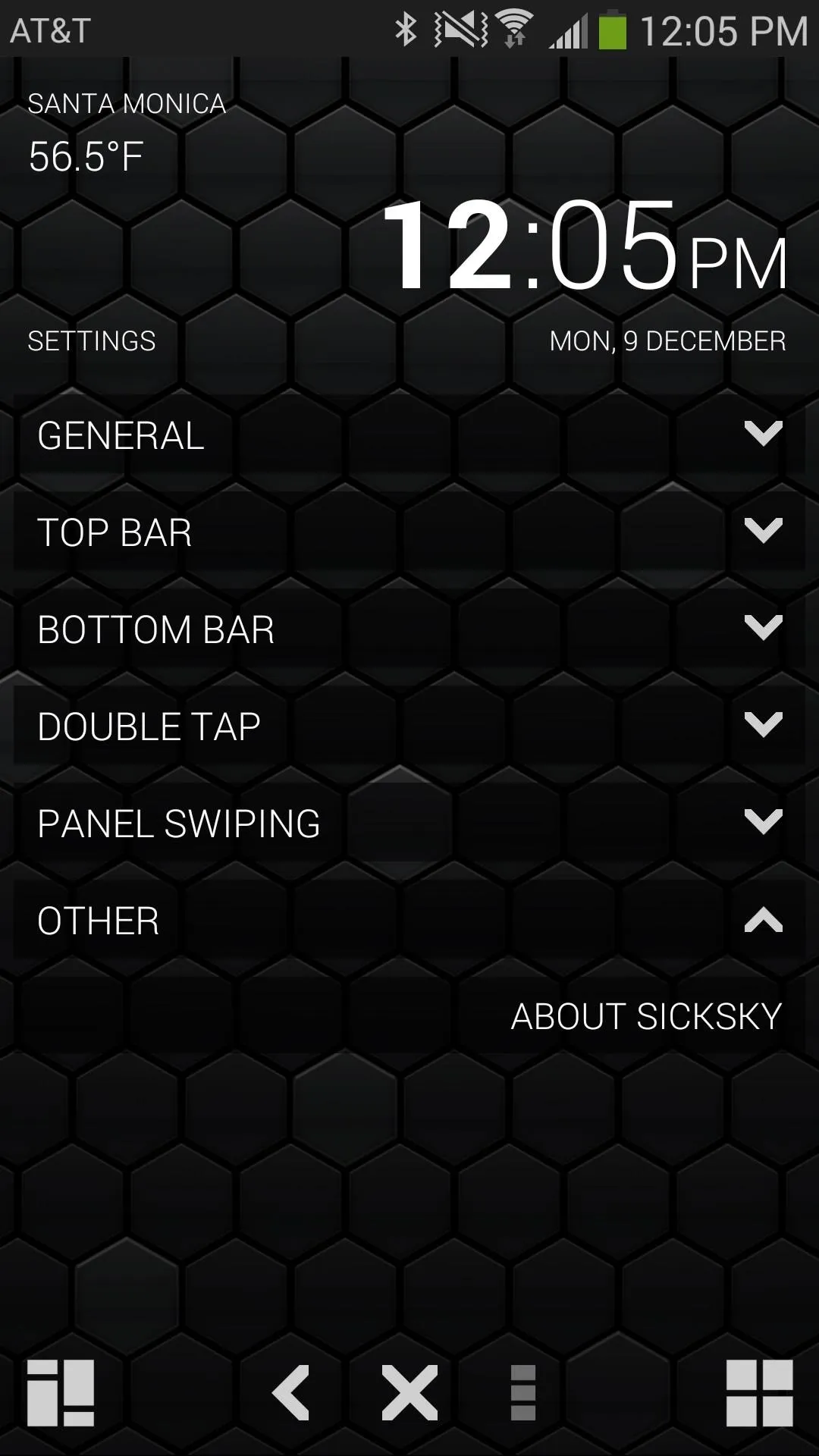
The final part of the launcher are the settings, which you can access by swiping down. From this page, you can mess with things such as using metric units for weather, changing the time format, toggling double-tap, edit which page appears when you swipe, and more.


Since the launcher is currently in beta, there is a huge upside to what the application will be able to do. So far, I'm really enjoying the simplicity of the launcher. Having to only navigate through a few pages makes it very easy to access anything I need to. If I need to mess with anything that I can't easily access, like the phone's settings, I can just use the drop-down menu and long-press any settings I want to use.
In the future, lookout for a more detailed weather page, icon packs, a full screen mode and perhaps custom grid size settings for the apps grids. While widget support isn't off the table, it isn't something the developer is looking to implement soon.










Comments
Be the first, drop a comment!