There are a ton of streaming services available at your disposal in the Google Play Store—Spotify, Pandora, TuneIn Radio, Last.fm, and the list goes on and on. These apps help satisfy my day-to-day cravings for good beats, but I tend to do a little too much hopping around from music app to music app (and music widget to music widget) in the process.
Google Play Music makes it easy to play songs offline, Pandora is good for setting up radio stations based on a certain artist, and Spotify (my personal favorite) lets you stream music from across the globe.
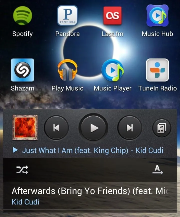
Having all of these music applications can maximize the tunes at your fingertips, but can become excruciating to deal with one by one. Sure, you could add quicker access with specific widgets for each individual app onto one or two home screen pages, but that takes up a lot of space and clutters things very quickly.
To combat this problem, developer Chris Bates created Media Utilities, a music widget to rule them all. Bates was a former iOS user who wanted to replicate some of the features he had on his iPhone, so he "created an application that looked and worked a lot like the music controls in iOS."
Media Utilities supplies you with a single widget to control all of your media apps, focusing on the most recently used music app. It can be used for music streaming with Spotify and Pandora, as well as with music stored on your device.
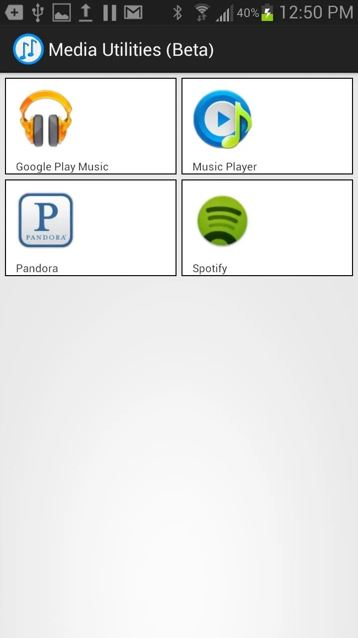
When you first open up Media Utilities, you'll be taken to its lone homepage showing you all of the apps on your phone that are accessible. From there, you can exit the app and long press anywhere on your home screen to add the Media Utilities widget, which comes in over 10 different sizes.
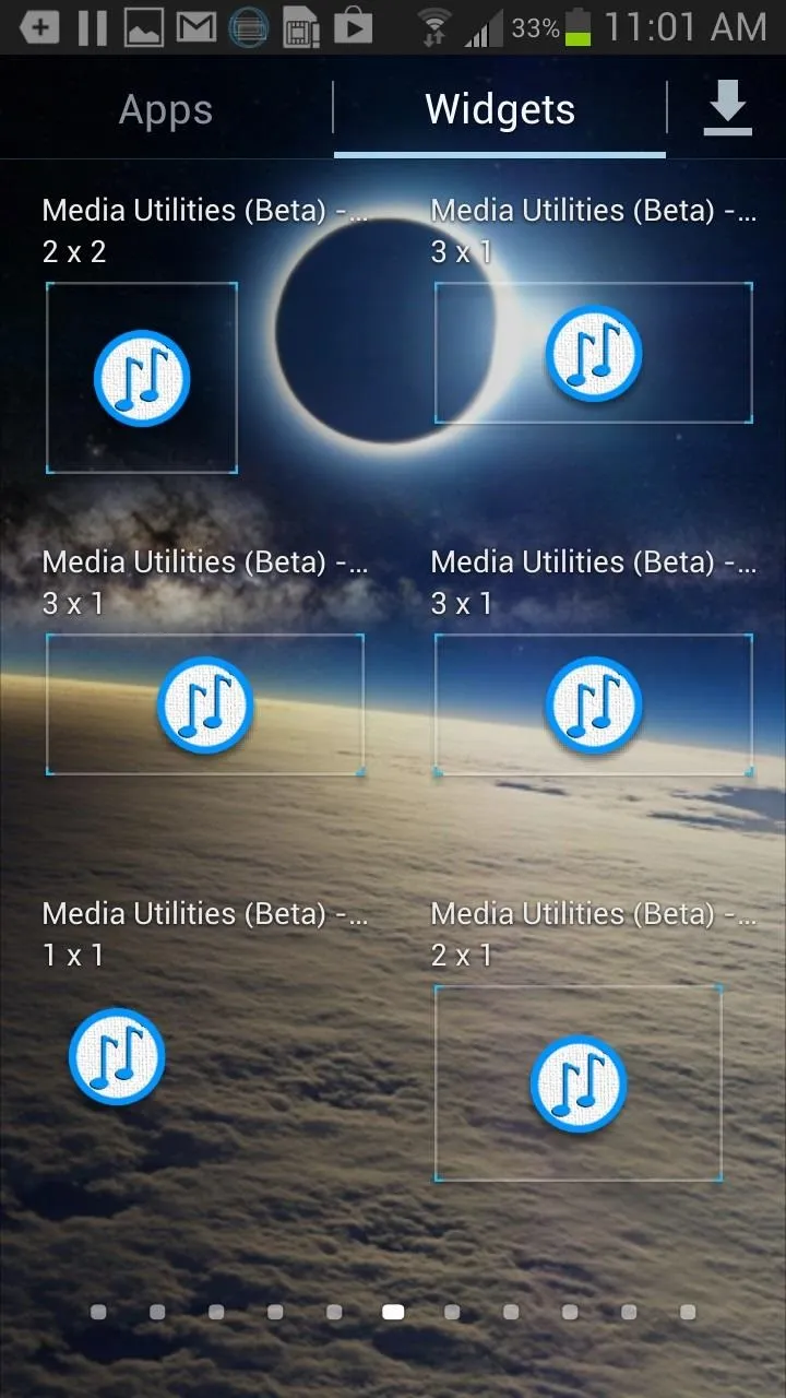


Once you apply the widget of your choice, you can customize the width, length, transparency level, and color of the widget and its borders. You can go with small widgets (if you like to manage space) or go with a large widget (which I prefer because it shows off the album cover).
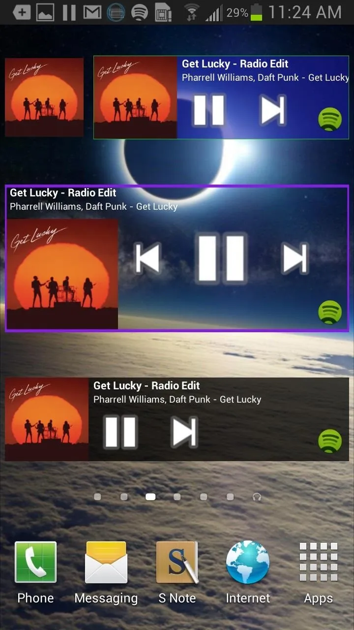
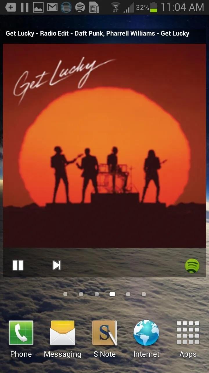


So far I've used it seamlessly with my small music app library, so you'll have to test out any other music apps to see if they're compatible with Media Utilities.
The only negative thing about this is that you cannot access your different music services straight through the widget. You'll still have to open up either Spotify or Pandora to be able to manage the last used music service through the widget. Still, it sure beats having 5 to 10 different widgets for each one!
Note: The application is currently in beta, so let us know in the comments below if your favorite music app did or didn't work, or if there are any bugs.











Comments
Be the first, drop a comment!